Lead Generation for Trades: Why Most Websites Fail
Lead generation for trades is essential. If one part of the system isn’t working, you’re losing thousands of pounds over a year.

Chris Good
Digital Strategist
Lead generation for trades is essential. If one part of the system isn’t working, you’re losing thousands of pounds over a year.
I reviewed three local plumbing sites to compare their conversion journey- and the results might surprise you. I recommend watching that video to further understand what is discussed in this article.
By the end of this article, you’ll have a deeper understanding of what a trade services website should be offering in order to get those customers through the door.
Where lead generation for trades happens
Before we dive in, it’s important to note that lead generation does not begin on your website, but your website is crucial for getting potential leads across the line.
Lead generation begins with creating Visibility for your business. This can be through traditional marketing, but these days it’s through digital methods, such as:
- Google search
- Google Business Profile
- Local SEO
- Social media
- AI search recommendation
This isn’t rocket-science, it’s simply about ensuring your business is top of mind when your potential customers are aware of something they want or need.
A lead is not just a first-time potential customer; a lead is anyone who might have a need for your business, whether they have never used your business before or whether you fixed their burst pipe a year and a half ago.
Ensuring your business is Visible to all potential leads is the first essential step in generating revenue for your business in the next quarter.
Your website is the best digital asset you can own to serve as the hub of this Visibility.
How lead generation for trades happens
Being Visible is the first step in lead generation, but -once people are looking at your business- the question is “What do they see?”
It’s obvious that, whether they’re looking at a physical flyer or a digital brochure website, we want them to see professionalism, reliability, experience and availability; all the stuff you’d splat onto your company values section.
In the web and SEO world, we focus on evidencing EEAT:
- Experience,
- Expertise,
- Authority and
- Trustworthiness.
We focus on EEAT because it encompasses the best foot forward for a company’s values, but this is also the scaffold that search engines, such as Google, use to filter the best businesses to the top of the listings.
This means that if a website is made in such a way that the pages effectively demonstrate the business as having great EEAT, the business becomes more Visible. It just so happens that when a potential lead views your business website and feels confident in your Experience, Expertise, Authority and Trustworthiness, they’re more likely to actually click the Book, Buy or Call button.
So, the EEAT scaffold is not just great for achieving Visibility for your business in digital search, it’s how your website can actually convince visitors to Book, Buy or Call.
How to add EEAT to your website
So how do we design our websites to do this? This is where an amateur, visual-focused template from Squarespace pales in comparison to a professional website build.
A DIY business owner is going to focus on the visuals and likely not do a great job anyway. A professional build uses a combination of backend code, speed optimisations, structural and aesthetic design to optimise for SEO , customer journey and conversion. A professional build thinks like a customer. A professional grade website ensures:
- Website visitors will see and understand EEAT signals when viewing your website.
- Search engines and systems, such as AI models, can see it.
Adding EEAT to your hero section
EEAT elements need to be present on every page, always- but let’s start on the home page as it’s the page that new visitors will most often land on.
The first thing people will see on the home page visit is the Hero Section. This is the ‘banner’ displayed on the top of the home page and this serves as the first impression of a business.
The hero section should effectively present your 5 second elevator pitch and usually consists of:
- headings and text,
- an easy to understand ‘next step’ action for the visitor to take,
- an image (but only to reinforce the meaning of the text; it should never take centre stage or focus).
The contents of the hero section is absolutely crucial for your business, however a lot of clients or DIY business owners prioritise visuals or bad statements that feel important to them.
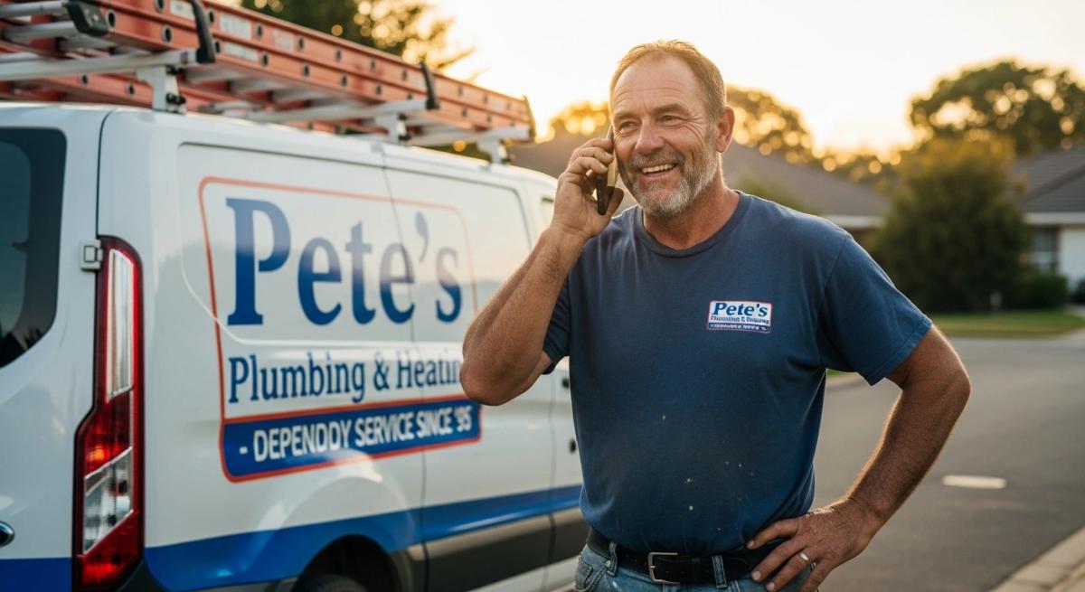
In my review of three plumbing websites, the website that had a stronger focus on an aesthetic hero section simply consisted of a picture of copper pipes. Not only did it take too long to load, but this did nothing to communicate Expertise, Experience, Authority or Trustworthiness. An image does not speak a thousand words; effective copy was needed here.
The most dated looking website in the review stack established more rapport between myself and “Bob” the plumber, with information.
It’s a simple example of how focusing on aesthetics can ruin your conversion potential.
What to include in an effective hero section and why
As mentioned, the hero section should function like the 5 second elevator pitch, so it needs to effectively communicate the What, Why and the How of the business, whilst establishing all aspects of EEAT.
It typically includes:
1. A Clear, Outcome-Focused Headline
Speak to the customer’s problem, not your company name.
“Fast, Reliable Boiler Repairs in Exeter — Same-Day Response”
That’s stronger than:
“Welcome to Smith & Sons Plumbing”
2. Immediate Trust Signals
- Number of years trading
- Accreditations
- 5-star rating indicators
- Location clarity
- Real photos
Trust must be visible, not buried.
3. Clear Primary Call to Action
For trades, this is usually:
- Book a Call
- Request a Quote
- Schedule a Visit
If you can’t always answer the phone, structured enquiry forms or booking systems reduce missed opportunities.
4. Clear Secondary Call to Action
Most visitors won’t book immediately.
They need reassurance.
A “View Our Services” or “See How We Work” pathway guides them deeper into your site instead of back to Google.
How to add conversion-focused navigation to your website
The home page navigation
Once a visitor is scrolling the home page, it needs to function like the ‘contents’ section of a book, helping new visitors to quickly understand where to find the information they are, specifically, looking for.
This is a matter of ensuring easy navigation, which is an absolutely essential part of conversion web design. It’s important the visitors get easy-to-digest scannable information with clear navigation links to further information or resources that they’re interested in.
An ideal home page will offer essential and most important information first; on a trade services website, the visitor is most likely looking for a particular service or emergency contact. Understanding the psychology of the visitor is what gives us this insight and we, essentially, need to simply consider what brings them to your website.
A strong structure typically looks like this:
- Hero Section – Clear offer, location, credibility, CTA
- Services Overview – Clear categories (e.g. Boilers, Bathrooms, Emergency Repair)
- About Snapshot – Who you are, where you operate, why you’re trusted
- Process Section – How easy it is to work with you
- Reviews Section – Visible, recent social proof
- Reinforced CTA – Repetition increases conversion
Header navigation
The header navigation on a website should be as simple as possible in order to bring focus to the most important website sections for your visitors.
A visitor will likely want to visit the Service pages or the About page before anything else, as they are actively looking for answers.
It makes sense to ensure primary services (or categories) have main focus on the header navigation, with the About page alongside these (I would suggest to the right of them). If there are many other items in the navigation, it might be worth tucking these into a “More” dropdown, to keep the navigation uncluttered.
Don’t hide your services
Given that most website visitors would like to view your services, you should do all you can to minimise the clicks it takes to reach the service page. For SEO as well as user experience, there should be one page per service, as opposed to one page listing all services.
Trade services offer a very broad range of services, as well as distinct categories of those services. For example, a plumber can tend to kitchens, bathrooms, heating, exterior systems and boilers, but can also offer these across the Install, Maintain or Emergency Repair categories.
Don't just list 'Services.' Give 'Emergency Boiler Repair' its own stage. Google ranks specialists, not generalists.
How to make your call to action effective
Every business website will have a Primary Call To Action; for a trade services website, such as a plumber service, this would usually be Book or Call.
As a plumbing or trade team might be on a job and unable to pick up the phone, it’s usually better to collect contact form submissions and to arrange a call back time, or an immediate booking, using booking software. This minimises missed leads when the phone can’t be answered.
Regardless, for service websites, Book Now or Call is usually the primary call to action
The importance of a secondary call to action
It’s important to note that, most of the time, there is a primary and secondary call to action. On the hero section for example, there would be a main button for Book, Buy, Sign up or Call, but it’s most unlikely that a visitor would click that straight away.
For this reason, there is usually another link to a second destination; this might be “Learn about our services” or some other information you deem most helpful to most visitors.
The primary CTA has still communicated the next and ideal step, but the secondary CTA takes the website visitor onto a crafted journey which will lead -eventually- to another presentation of the primary CTA
The most important call to action is the tertiary call to action: the lead magnet
This is not something that is spoken about enough. The truth is that most visitors to your website are not going to click your primary call to action and get in touch with you.
Sabri Suby explains the The Buying Pyramid, which shows that barely 3% of visitors are ready to hit that primary CTA.
The Buying Pyramid
Suby breaks down any given market into four distinct categories:
- 3% – Ready to Buy Now: These people have a burst pipe right now . They are searching "emergency plumber near me" and will call the first person who looks professional and answers the phone. Every one of your competitors is fighting for this 3%.
- 17% – Information Gathering Mode: These homeowners know they have a problem (e.g., a boiler that’s making a weird noise) but aren't ready to pull the trigger. They are researching options, looking at reviews, and trying to understand costs.
- 20% – Problem Aware: They know their bathroom is outdated or their water bill is high, but they haven't started looking for a solution yet. They are "procrastinating."
- 60% – Not Problem Aware: They aren't thinking about plumbing at all.
If they primary CTA is only catering to 3%, you need to find a way to work on the other 97% of the market.
Why a lead magnet call to action is essential for trade service websites
Only a small percentage of visitors are ready to book immediately.
Many are:
- Comparing quotes
- Researching options
- Unsure about pricing
- Looking for reassurance
If 3% of visitors might use your primary CTA, 97% are likely to leave.
If they leave your site without giving you their details, the relationship ends there.
A well-designed lead magnet can change that.
For example:
- “Free Guide: 7 Costly Boiler Mistakes Homeowners Make”
- “Free Bathroom Renovation Budget Checklist”
- “Get 10% Off Your First Service Visit”
More visitors will exchange contact details for something useful than will immediately book.
That allows you to:
- Follow up
- Build trust
- Educate
- Stay top-of-mind
Not only do these assets help to establish EEAT by showing off your expertise and building rapport, but they keep you in touch with someone who has shown interest in your services.
While competitors fight over the 3% ready to call, you’re building relationships with the rest of the market.
That’s digital strategy .
How to increase lead generation for your trade business
As you can see, there are many tricks and techniques available to maximise the likelihood of your website absolutely killing it for your lead generation, but it has to be built professionally to get professional results.
None of this is easy. That’s the truth.
If you run a trade business and suspect your website is underperforming, I offer a free Lead Generation Audit.
We’ll review:
- Visibility
- Trust signals
- Homepage clarity
- Service structure
- Call-to-action effectiveness
- Missed conversion opportunities
You’ll leave with a clear understanding of:
- What’s working
- What’s costing you enquiries
- What to fix first
No jargon. No pressure. Just strategy.
If you’re serious about turning your website into a consistent lead generation engine, book your free audit below.
Check out my review of three plumber websites here
Click to view review video
Chris Good
Digital Strategist
Chris Good is a Digital Strategist helping ambitious SME owners build digital systems that generate qualified leads and sustainable revenue growth. Based in Devon, UK.
Book a Consultation